Support our independent tech coverage. Chrome Unboxed is written by real people, for real people—not search algorithms. Join Chrome Unboxed Plus for just $2 a month to get an ad-free experience, access to our private Discord, and more. Learn more about membership here.
START FREE TRIAL (MONTHLY)START FREE TRIAL (ANNUAL)

It would seem another small tweak to the overall OS is on its way.
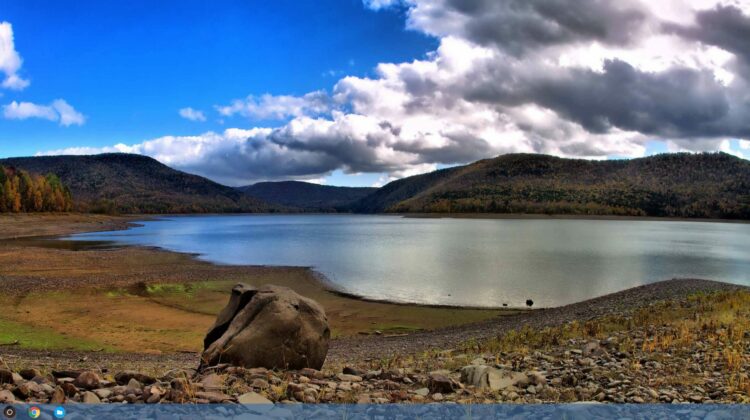
Found in this commit by +Brandon Lall, we can see that there is work happening – to be temporarily hidden behind a flag – that will allow the bar that houses your pinned apps to change color dynamically based on your wallpaper.
Now, this isn’t really a new thing with themes. As a matter of fact, Windows has done this since the first builds of Windows 8, so it isn’t a novel concept.
What this change does signal is a continued effort to make Chrome OS better and more attractive.
Signs Of A Maturing OS
Think about it: when you first begin developing an OS, your development time is spent on making stuff work. How it looks is largely a second thought. Remember early versions of Android? Every new version seemed to change the look without any real central theme. They were throwing stuff at the wall and seeing what stuck.
Then came material design. Though it has taken some time for a full implementation, there is a central focus to where the design is going.
The only reason they can focus on this now is the fact that Android has made it to the point that they don’t have to spend all their efforts and time on just getting things up and running.
The same is true with Chrome OS. Sure, there are lots of kinks still to be worked out and I don’t think the design aesthetic is terribly tight at this point, but the fact that this kind of stuff is showing up on the radar is encouraging. It means Google is looking past the functional development phase and is beginning to really spend some time on the look and feel, not just how things work.
Though it will likely still be a considerable time before Chrome OS (especially with the addition of Android apps, tablets, and detachables coming) gets to really have attention turned to its finer parts, the fact that we’re seeing it on the horizon is a hopeful clue that the time is coming.
I, for one, look forward to a future where development of Chrome OS can catch up to the hardware and little things like transitions, UI, UX, and theme colors can be given plenty of development attention. It is a sign of maturation and a sign of solidity. And it is coming.