

Support our independent tech coverage. Chrome Unboxed is written by real people, for real people—not search algorithms. Join Chrome Unboxed Plus for just $2 a month to get an ad-free experience, access to our private Discord, and more. Learn more about membership here.
START FREE TRIAL (MONTHLY)START FREE TRIAL (ANNUAL)
If you have ever squinted at your pinned browser tabs trying to figure out if you were clicking on Google Calendar, Google Meet, or Google Drive because they all look like identical four-color outlines, relief is finally on the way.
According to a new report from 9to5Google, a radical visual overhaul is coming to the entire Google Workspace ecosystem. Google is abandoning the rigid “four company colors in every icon” mandate and replacing it with distinct, gradient-heavy designs that prioritize usability and instantly recognizable shapes.

The driving force behind this new look appears to be AI. The new icons feature the same gradient effect we’ve recently seen applied to the Google ‘G’, Gemini, and Google Photos. It is a subtle visual signal that generative AI is now deeply woven into the fabric of these productivity tools.
The End of the ‘Homogenous’ Era
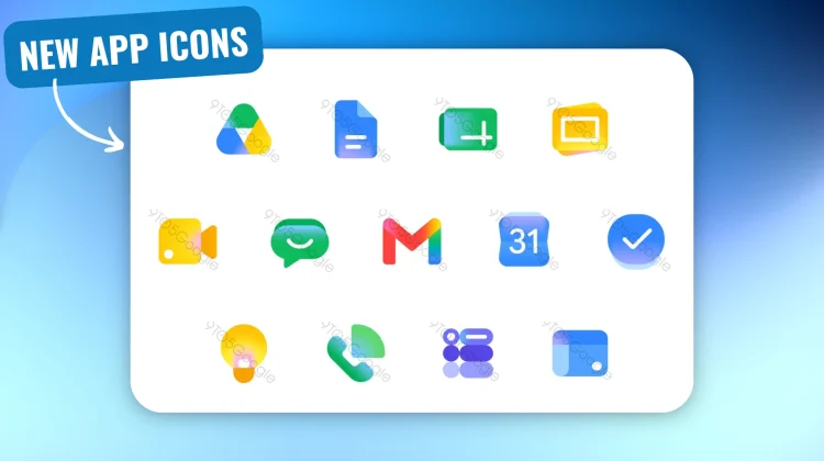
Google is tackling the biggest criticism of the current icon set head-on: everything is finally getting its distinct identity back. The overarching page containers have been dropped, allowing for larger, more unique shapes. Here is a breakdown of the most notable changes heading to your app drawer:
- Gmail: The classic ‘M’ envelope shape remains, but it is slightly more rounded. More importantly, red is once again the fiercely predominant color. It is the only app in the new lineup that retains small touches of the other three Google colors (yellow, green, and blue).
- Google Drive: The red is completely gone. Drive now features a bulbous, rounded triangle utilizing just the green, yellow, and blue that correspond to the Docs, Slides, and Sheets editor apps.
- Calendar: A true throwback. The new Calendar icon ditches the four-color outline and returns to a classic blue, skeuomorphic-like flip-style design.
- Meet and Chat: These two see some of the biggest departures. Meet is now a predominantly yellow video camera, while Chat becomes a friendly, pill-shaped message bubble in a nostalgic Hangouts-green.
- Docs, Sheets, and Slides: Docs remains a vertical piece of paper, but Sheets and Slides cleverly switch to a landscape orientation to reflect how those apps are actually used.
- Tasks, Keep, Voice, and Sites are also getting refreshed, unified color treatments that ditch the confusing multi-color outlines.
This redesign feels like a massive win for accessibility and daily usability. We don’t have an exact rollout date for these new icons yet, but given the level of detail in the leak, it’s likely we will start seeing them populate across Workspace very soon.
SUBSCRIBE TO UPSTREAM
Get Chrome Unboxed delivered straight to your inbox
Upstream is our flagship, curated newsletter with the top stories, most click-worthy deals, giveaways, and trending articles from Chrome Unboxed sent directly to your inbox a few times a week. Join 31,000+ subscribers.