


It appears Google offered an early, unintended glimpse into its design future recently, accidentally publishing and then retracting a blog post detailing the philosophy and extensive research behind Material 3 Expressive. Thanks to the persistence of the Wayback Machine (and eagle eyes by the folks over at 9to5 Google), the full post was saved (well, mostly saved), providing a deep dive into what Google describes as the “most-researched update to Google’s design system, ever.”
Moving beyond “boring”
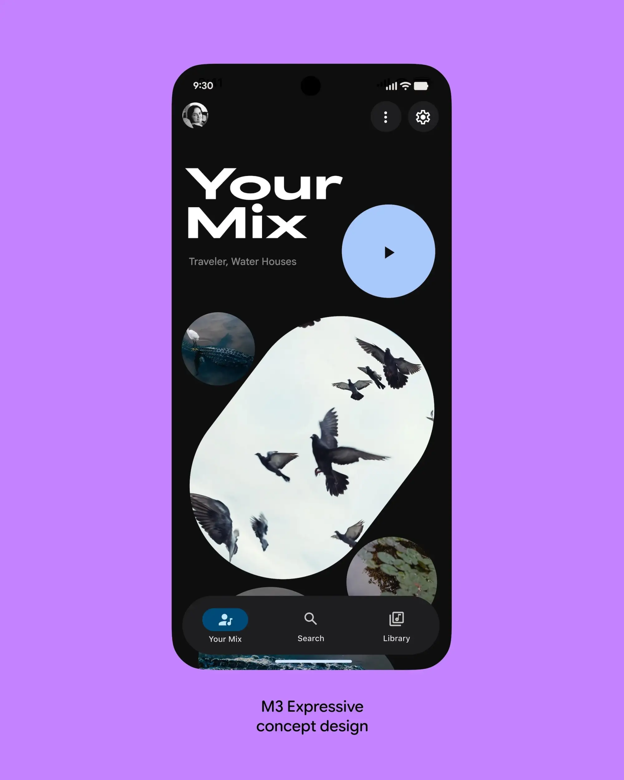
This initiative, also known as “M3 Expressive” or simply “expressive design,” marks a pretty sizeable pivot. Google aims to move beyond app interfaces often perceived as merely “clean” or sometimes just “boring,” striving instead for designs that forge a real emotional connection with users. The origin apparently traces back to a 2022 conversation sparked by a research intern’s findings shared in a Munich beer hall, leading to a team-wide debate: Why did so many apps look alike? Couldn’t design evoke more feeling?

A foundation built on extensive research
What followed was a three-year collaborative inquiry across Google’s research, design, and engineering teams. This involved iterating through numerous design concepts and conducting a massive research program: 46 separate studies, involving over 18,000 participants worldwide, using methods like eye-tracking, surveys, focus groups, sentiment experiments, and usability testing. The goal was to dial in a system that is both aesthetically compelling and highly usable, rooted in established usability best practices.
Core elements and goals
So, what constitutes “expressive design”? Google defines it by the deliberate and often bold use of color, shape, size, motion, and containment. These aren’t just visual flourishes; they’re positioned as fundamental tools for enhancing usability by drawing attention to key interface elements, making primary actions stand out, and logically grouping related components. It’s about creating “delightful user experiences” that also help people achieve their goals more efficiently.
The research didn’t just look at overall screen concepts; it drilled down into individual components. Studies examined which progress indicator designs made waiting times feel shorter, how large buttons could be to improve tap times without visually overwhelming the screen, and optimizing new elements like the “floating toolbar” (similar to the one in Google Chat) for perceptions of being modern, clean, and energetic, alongside raw usability and noticeability. Crucially, accessibility was paramount, with Google noting efforts to exceed existing standards for tap target size and color contrast to make interfaces better for everyone.
Users prefer emotion and “coolness”
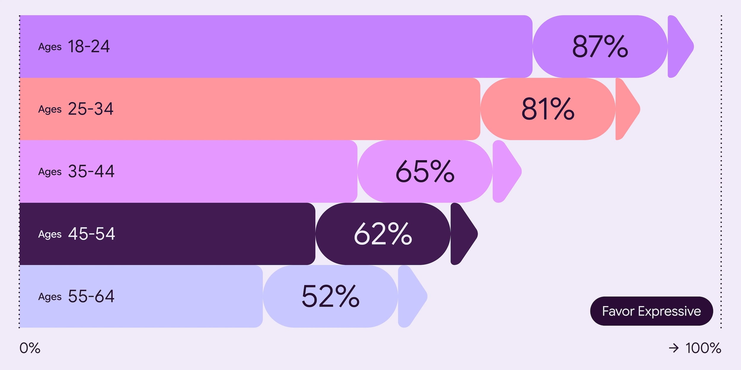
The results? Google found that people demonstrably prefer expressive designs. Across all age groups, well-executed expressive designs were favored over non-expressive counterparts following standard iOS Human Interface Guidelines. This preference was particularly strong among 18-24 year-olds, reaching up to 87% in some tests. Researchers used specific emotional attributes like ‘Playful’, ‘Energetic’, ‘Creative’, ‘Friendly’, and ‘Positive’ to test and optimize designs for desired reactions.

Beyond preference, expressive design significantly impacted perceived “brand coolness.” Referencing existing academic research, Google found that M3 Expressive boosted perceptions of brands being more relevant/”in-the-know” (subculture perception +32%), fresh and forward-thinking (modernity +34%), and bold/innovative (rebelliousness +30%). This “coolness” wasn’t just a vanity metric, either; it actually suggested users were more likely to want to switch to products featuring this design style.
Enhanced usability and speed
Perhaps most importantly, the research showed expressive designs are easier to use. By strategically using color, size, and shape, these designs guide user attention more effectively. Participants using eye-tracking glasses were able to spot key UI elements up to 4 times faster in expressive versions compared to current Material 3 designs across various test apps. This translated to faster tap times on key actions as well.
The provided email app case study vividly illustrates this. Making the ‘Send’ button larger, giving it a distinct color, and placing it near the keyboard resulted in users visually locating it 4x faster than the small icon tucked away in a top toolbar.
Even more strikingly, the research indicated expressive design helped level the playing field across age groups. While older users (45+) typically show slower fixation times in usability studies with current M3 apps, expressive designs effectively removed this age effect, allowing older participants to perform on par with younger ones in spotting key elements quickly. Furthermore, expressive design tested positively for visual appeal, intuition, and ease of use among participants with varying movement and visual abilities, thanks to larger targets and high-contrast elements.
Context and familiarity matter
However, Google wisely includes caveats. Expressive design isn’t a magic wand, and context matters. It must be applied thoughtfully, respecting established UI patterns. Designs that broke familiar paradigms (like replacing a standard vertical list with scattered images for a playlist) suffered in usability despite looking “modern.” Removing essential text labels also hurt usability. Effective implementation requires using the expressive components within the established design system guidelines, not sacrificing core functionality or clarity for visual flair. Google also acknowledges that unfamiliarity might initially impact perception, though they expect this to lessen as adoption increases.
That’s a lot to process, right? While the original post was quickly unpublished, the archived details paint a clear picture of Material 3 Expressive as a significant, data-backed evolution. It’s an ambitious attempt to blend emotional appeal with measurable usability improvements, pushing Google’s design language into more vibrant territory while simultaneously aiming to enhance accessibility and efficiency for all users. We’ll be eager to see how Google debuts all of this – likely at Google I/O 2025 later this month – and how these principles begin to reshape Google’s apps and the broader ecosystem as a whole.
Join Chrome Unboxed Plus
Introducing Chrome Unboxed Plus – our revamped membership community. Join today at just $2 / month to get access to our private Discord, exclusive giveaways, AMAs, an ad-free website, ad-free podcast experience and more.
Plus Monthly
$2/mo. after 7-day free trial
Pay monthly to support our independent coverage and get access to exclusive benefits.
Plus Annual
$20/yr. after 7-day free trial
Pay yearly to support our independent coverage and get access to exclusive benefits.
Our newsletters are also a great way to get connected. Subscribe here!
Click here to learn more and for membership FAQ