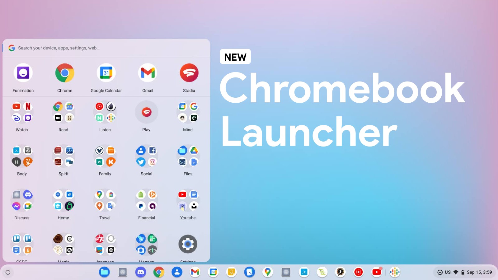
This past April, we reported on the new Chromebook Productivity Launcher gaining the ability to organize your apps and search results into categories in order to prevent information overload. Traditionally, searching with the ‘Everything button’ returns a wall of results that, while they appear in order, are not grouped or segregated in any meaningful way. It was simply a show of the immaturity of Google’s OS in this area, but the developers have been hard at work on improvements.
Now, a new developer flag on the Chrome OS Canary channel that automates this process on your behalf is finally implemented by default, indicating that the entirely reimagined Chromebook launcher could be closer to public release. “Launcher Categorical Search” previously had to be enabled manually, and even when it was, the categorization in the launcher lacked stylization and functionality. It was a barebones implementation that was ready to be worked on, but today, I’m happy to report that it’s looking and feeling great!
Launcher Categorical Search
Launcher search results grouped by categories – Chrome OS
#categorical-search
As you can see in the video above, searching for anything in the new Windows Start-style launcher yields results that are parsed out into “categories”. By this, I just mean that they appear under text headers that separate them into chunks based on the result type for easier viewing and selecting.
It’s a worthwhile feature, and I’m glad to see it finally coming to fruition. I was under the impression based on my earlier preview of the flag that it would work more like Windows 10 or 11’s start button, having clickable filters for each type of result – web, files, apps, and so on – but this is clearly not the case.
It’s simple and effective and allowed me to quickly locate things that were important to me, but I do miss the larger icons that used to appear in search. Unfortunately, Chrome OS rid itself of these prior to this new categorization, opting for smaller, left-aligned icons instead. It’s cleaner, and more professional looking, but less glanceable, for sure.
I’m still stoked for you all to get this new Chromebook launcher in your hands on the out-of-the-box experience for your devices, and I truly believe that we’re inching ever closer to that day. I wouldn’t be surprised if we see the Productivity Launcher experiment – whether an optional or forced replacement for the current full-screen launcher – shortly after the new year.
Obviously, there are still some things for the developers to work out, like the fact that each category says “Best Match” instead of actually featuring an appropriate title, but everything is still sorted properly otherwise. Let me know if you like this method or categorizing apps and results while you search, or if you think it would be better off some other way. If you’re running Chrome OS Beta, let me know if this flag is now available to you. In the meantime, check out all of our other coverage on the new Productivity Launcher!


Leave a Reply
You must be logged in to post a comment.