
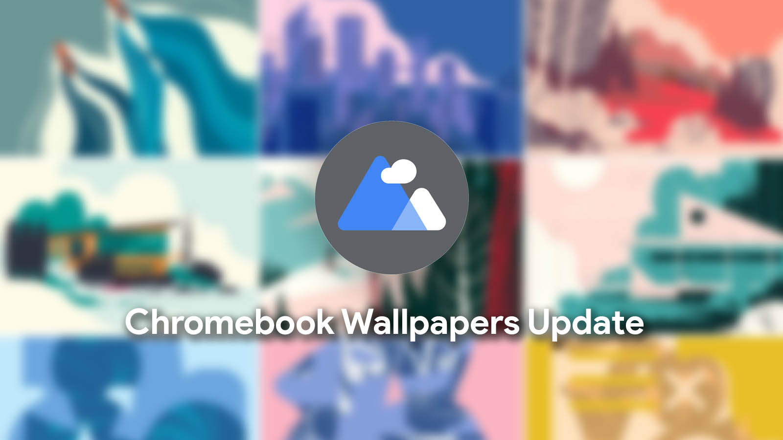
Google has long been in the process of completely revamping the Chromebook wallpaper picker experience. It’s becoming a system web application (SWA) with a bold, centered design that better accommodates all of the wonderful wallpaper collections that have been added over the past year. It features all of the same images as Pixel phones in addition to your locally stored images that can be chosen if you’re in the mood on any particular day.
Literally just one month ago to the date, the development team finally added the one feature the new SWA was missing that existed in the previous iteration of the app – a Daily Refresh option. Once clicked, this would swap your wallpaper for a new one that existed therein every 24 hours. The next day, they added options for cropping or stretching the image you select in order to better fit it on your display.
Now, in Chrome OS Canary, the Wallpaper picker responds to the OS dark mode toggle! Overall, it’s been implemented nicely and everything looks exactly as it should – well, aside from the top bar. Sporting an ugly and out-of-place white strip, it truly feels like the only thing that needs to be fixed before the company can launch this to the masses in place of the old app.
Having just updated the File Picker to use beautifully rounded edges and a two-tone top bar styling yesterday, I’m not really worried about the inconsistencies with the wallpaper app right now. It’s likely going to be the next app that gets updated to use Google’s new UI design, and I truly can’t wait. The more windows get rounded corners, the more everything will feel more cohesive and match with the style of context menus, the shelf, and so on.
In addition to going dark, the experience also has a bunch of polish that was just added in. Not only does the selected wallpaper have a nice outline around it that animates with a checkmark when selected, but in place of the ridiculous loading bar that used to appear while the image was pulled from the web, a new loading animation with placeholder shapes that shine now exists. This is very reminiscent of how Pixel phone and Chromebook launcher content looks before being fully loaded in upon boot.
Newsletter Signup


Leave a Reply
You must be logged in to post a comment.