
With the recent Workspace redesign, a bunch of Google’s icons have been getting refreshed, for better or worse. The internet can’t seem to make up its mind on whether or not they’re good, but one thing that’s almost completely unanimous is that the icons that take on a single color instead of Google’s four primary ones look much better.
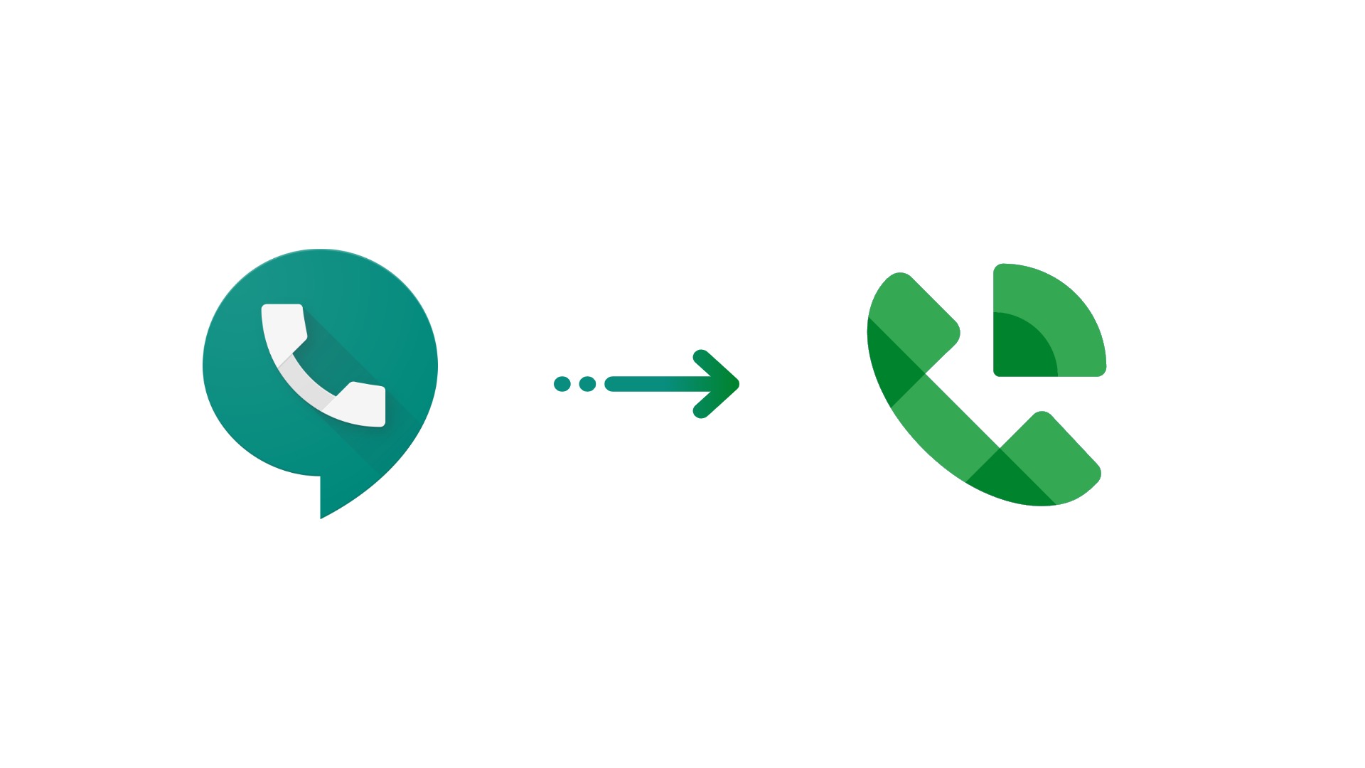
Take, for example, the new Google Keep icon. It looks fantastic because it’s just yellow. While we were all hoping that more icons would surface with this design principle in mind, Google Voice decided to show off a bit. Android Police recently took notice of the desktop site displaying the new layered green logo and we have to say – it looks amazing!
The simple design of a phone with sound or someone’s voice coming out of it communicates the service’s offerings just as good as the previous logo, but taking the iconography’s ‘talking’ visuals in a new direction than the chat bubble surrounded it allows Google to place the new icon on a white plate or circle to fit with the rest of their adaptive icons. It may take a few weeks to receive the new look, but once you do, I think you’ll be pretty happy with it as the old icon was looking pretty dated.
Do you think that all of the new icons should feature a single color design? A problem that I’m not sure many have considered yet is that eventually, Google will run out of core colors (and many colors don’t even match their brand), which would leave them in the same predicament as they’re currently in, where a lot of the icons are using the same colors. Let us know in the comments what your thoughts are on the new green-only logo for Google Voice!
Newsletter Signup

Leave a Reply
You must be logged in to post a comment.