
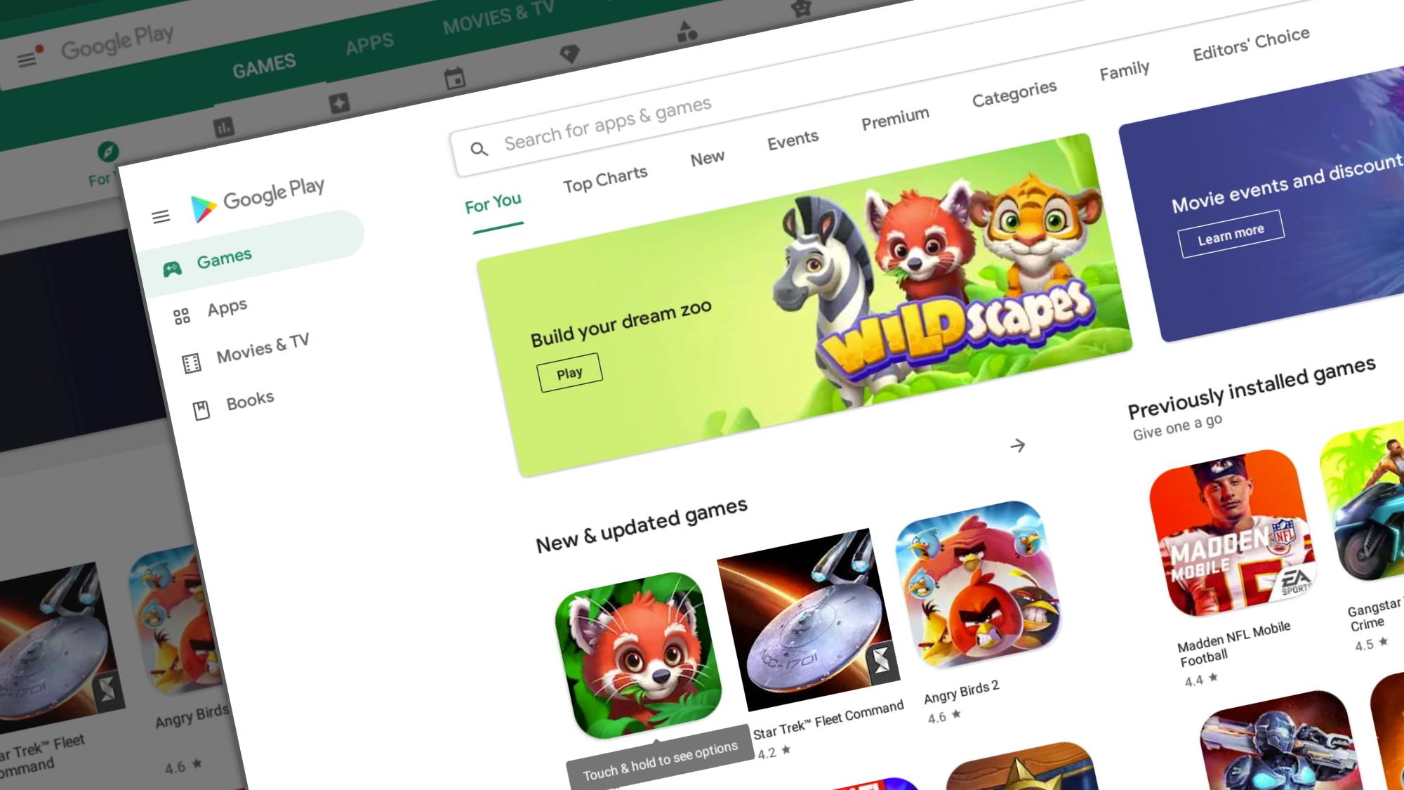
Back in June of this year, plenty of news outlets reported on a new, overhauled, Material-designed Play Store waiting in the wings to grace your favorite Android devices. Something happened during that roll-out, however, and it was paused and then halted all together. While we aren’t sure what the issue was before, all that looks to be ironed out now and the newly-renovated Google Play Store is upon us.
This new UI is never as clear, obvious and beneficial as when viewed on a larger screen like a Chromebook. Google’s prior design was beginning to feel very, very dated and a bit claustraphobic. This new design takes everything to white in a clean, clear, clutter-free interface that I can only describe as a breath of fresh air. Just look at the before and after and tell me that isn’t pleasing to the eye:
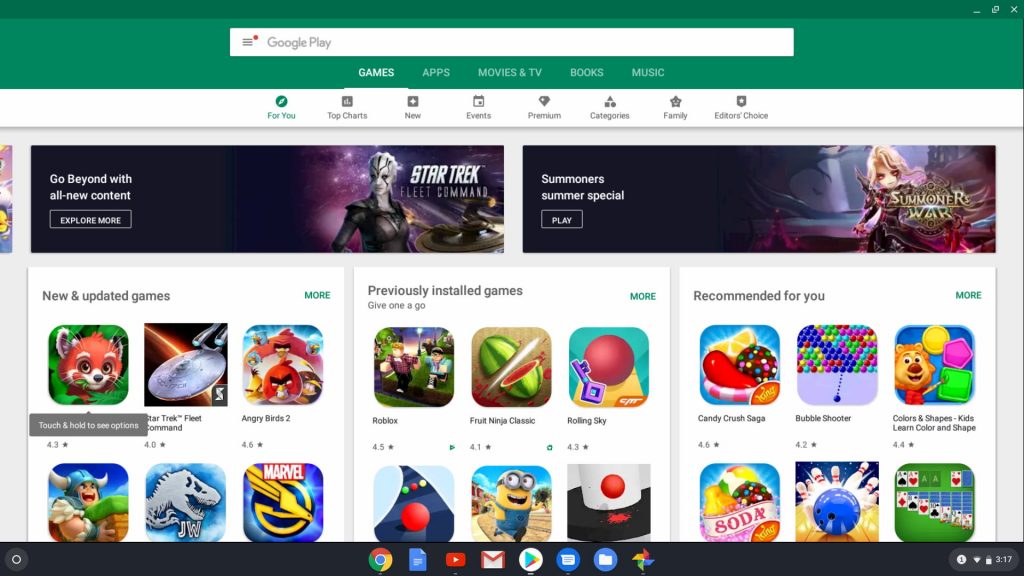
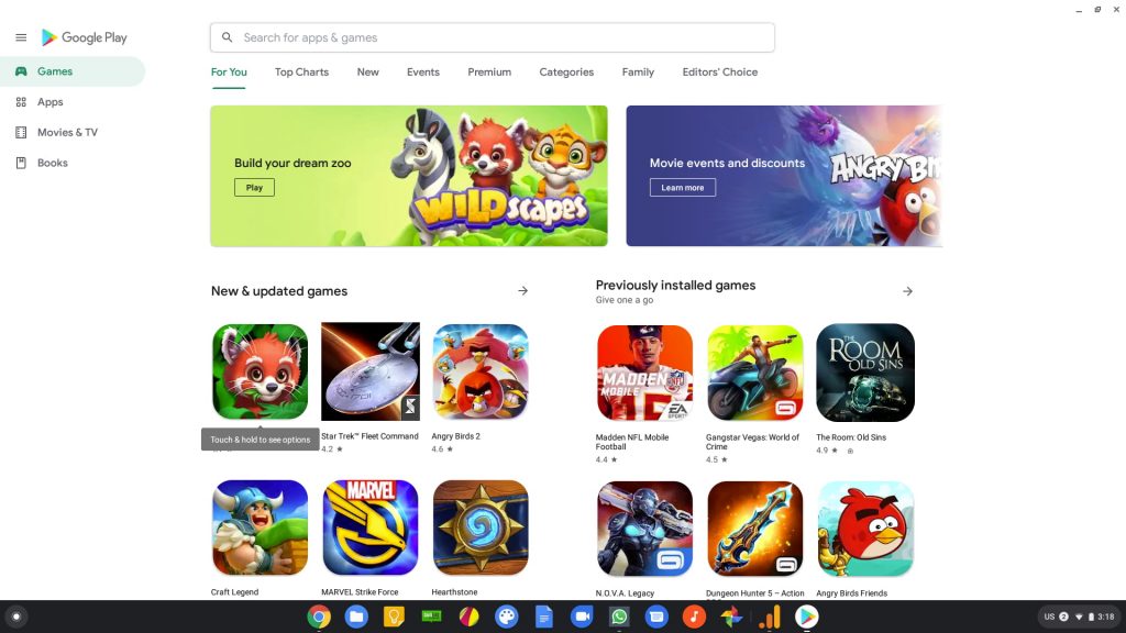
The difference is striking and I was honestly taken aback when I opened the Play Store this morning and saw the difference. Sure, it looks good on a phone, but this new layout and design really shine on a Chromebook. With the persistent menu to the left, the clean and minimal design, and a much clearer navigation, I think Google has absolutely nailed the look and feel of the Play Store this time around.
This is also a shining example of Google showing developers exactly how to build and design apps that work on both phone and desktop and doing it beautifully. The old Play Store design has never looked quite right on a Chromebook, but this new look feels completely at home and native on my Chromebook. With Google continuing to meld the two ecosystems, small design tweaks like these are welcome changes that only further enhance every users’ experiences across the board when using a Chromebook.
Newsletter Signup

Leave a Reply
You must be logged in to post a comment.