
I can’t tell you how much I absolutely hate the current Android widget for Google Play Books. It gets you quick access to books by showing you a cover flow of the titles you’ve most recently accessed, so by that standard, it’s functional enough and isn’t really bothering anyone by existing, but man, is it ugly! A vertical or rather diagonal book stack that you must swipe through with minimal information and really no customization allows me to say with confidence that it’s the least attractive widget I’ve ever seen, and that alone makes it not worth using.
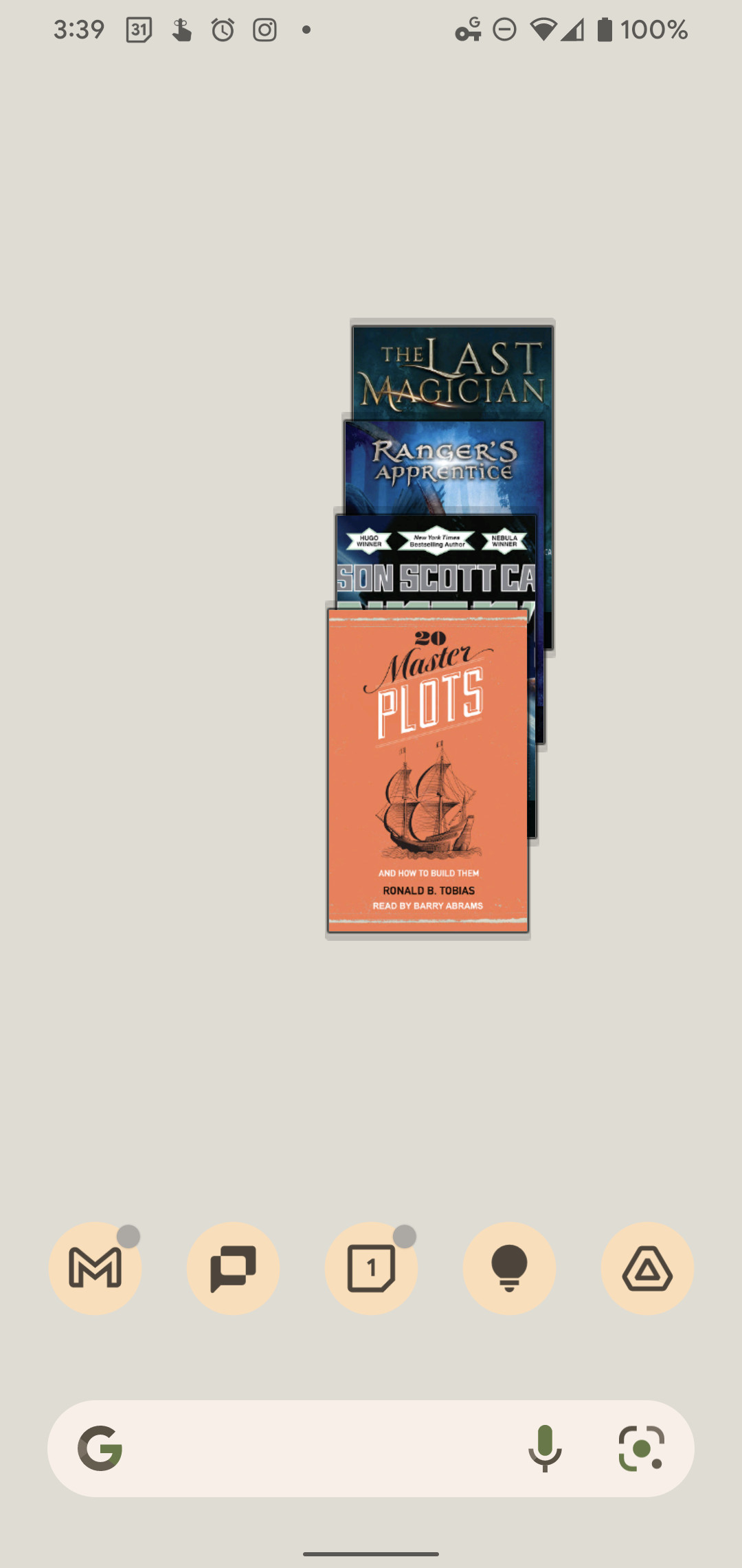
When I buy books and audiobooks, I want to be proud of them, and this just ain’t it, Chief. I don’t want to go on too long about how bad it is, because I’m sure you get the point, but the fact that it sits off to the left just a tad even though it’s centered, and can’t be laid out in a landscape or wider way has just always perplexed me. Luckily, in a blog post today, Google announced that over the next few days, it will be rolling out a replacement widget that’s built completely from the ground up and displays much more useful information and with a more appealing design.
Keep that holiday reading within easy reach, access your full library of books and even keep track of your audiobook progress with the new Google Play Books widget.
The Keyword
Surprisingly, the new widget will allow you to access your entire library, not just a few items you’ve recently read or listened to. I love this, and can’t wait to use it! I wish they had given a visual preview of it today, but we’ll have to wait to see its gorgeous, new design. All of the new Material You widgets we’ve seen release with Android 12 are exciting and well thought out, so I hope it shows up sooner rather than later.
Something else that’s interesting is the mention of the new widget including audiobook progress indicators. Being able to see what percent you’ve listened to up to that point right from your home screen without having to open the app whatsoever feels like a feature that’s been sorely missing all this time. Moreover, audiobooks do appear in the carousel for the current widget, but their cover images are visually forced into the same aspect ratio as regular books, making it hard to determine what’s what.
It sounds like the developers have given this redesign a lot of thought, and it was a nice little nugget to find buried amidst Google’s other announcements today. Some of the features they’re going to be including in the new widget really weren’t things I had considered or placed on a wishlist, but now that I hear about them, I wonder how we’ve gone this long without.
Google’s widgets have always been gorgeous on iOS, and with Play Books getting an upgrade (even though it’s practically the last widget to get said upgrade) I’m glad to see that Android is finally going to experience the same playful yet still useful designs of its competitor.
Newsletter Signup

Leave a Reply
You must be logged in to post a comment.