
The year just and only began, but Google is already on an apology tour. After more than a decade of neglecting the tablet experience with its apps and services, it’s finally updating a ton of them to be better optimized for larger displays. It’s already done more over the past few months than it ever has, but not because it’s feeling charitable.
The Nest Hub successor – the Pixel Tablet – is releasing this year, and they are dead set on making sure that undocking it and utilizing it around your home for entertainment, notetaking, smart home control, and more doesn’t suck.
The latest of these apps to get the treatment is Google Search. Traditionally, this featured a one to two-column layout for news articles that would populate the “Discover” tab as shown below. Now, as per 9to5Google, a third column has begun showing up for some users, and it’s gorgeous.
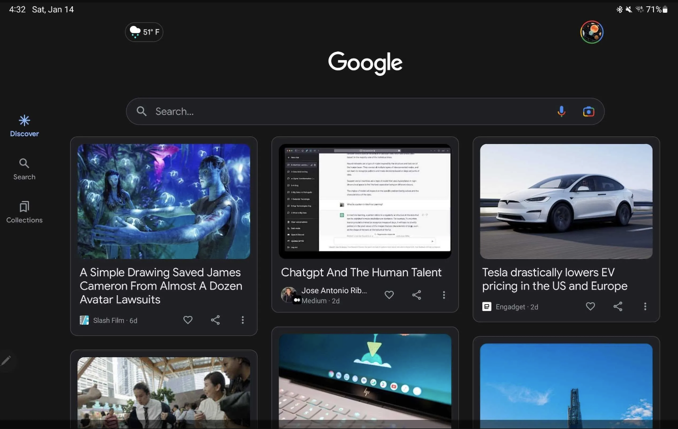
I’m not sure if it’s my obsessive need to intake more information than I can process at one time or something else entirely, but I have been hoping for this for quite some time. More is less – that is to say that more on the screen means less scrolling, and with a tablet that already weighs more than a phone, this is a godsend for extended usage.
What you’re seeing above is running on version 14.2.7.26 beta of the Search app. Another significant change is that news cards now have a Material You background which better separates each of their interactive share, like, and options icons from one another.
Newsletter Signup

Leave a Reply
You must be logged in to post a comment.