While we are certain to see Virtual Desks arrive in Chrome OS 76, the feature will likely still be behind a flag for the time being. The bulk of the work is done and Virtual Desks are basically ready for user consumption, but there are tiny tweaks here and there that still need to be addressed, and those changes mostly revolve around updates to the overall UI and general behavior of the animations.
Today, thanks to a slightly different bug report than the one we’ve previously been tracking, we have a few new videos to share that highlight some pretty slick animations being added to the Virtual Desks experience, and these new animations honestly just make me smile a bit. You see, with many things that get added to Chrome OS, the overall look and final polish is simply an afterthought. Google tends to lean more towards engineering and function at the sacrifice of fluidity and beautiful design aesthetic.
Take Android, for instance. Android has long had many capabilities that far surpass iOS, but the general experience of navigating through those capabilities was a bit ragged for many years. Merging function with a clear design language and look, Android has progressed a ton in the past few years into an attractive, intuitive, and beautiful experience. That simply could not be said about Android in general just four or five years ago.
Chrome OS has evolved in much the same way. Chrome OS 70 – released about this time last year – brought about a massive UI overhaul for the platform that changed a ton of functionality and aesthetic properties. In those changes, however, we were met with tons of transition issues, dropped frames, and UI bits and pieces that simply felt half-baked. Even now, nearly a year later, there are things introduced in Chrome OS 70 that still don’t feel finished. Notifications, the blur effect for the app tray, and overview modes are all examples of this. They’ve improved greatly, but smooth and fluid they are not.
A Better Approach
With the development of Virtual Desks on Chrome OS, the whole process has been a breath of fresh air. With the development happening mainly out in the open in the Chromium Bug Tracker, we’ve been able to follow along right off the bat and see all the changes that have happened over the months since the idea of Virtual Desks on Chrome OS began. What I’ve seen over the course of this time is an attention to details that aren’t always just functional.
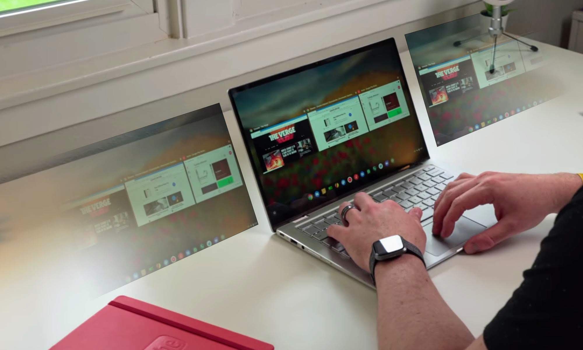
Take a look at these three videos below that have recently surfaced. In the first, you have a new animation added for the times you use a keyboard shortcut to move an open window from one Virtual Desk to the next. Instead of the window simply disappearing and you needing to assume where it went, the developers have taken the extra effort to make a really great looking animation that shows you exactly where your window is traveling. Check it out.
In this second video, we have a simple animation that isn’t the most important functionality element with Virtual Desks, but it gives a subtle and reassuring nudge to the user that they’ve reached the end of their Virtual Desks. With 4-finger swipe to switch desks already confirmed, users will likely be sliding through desks quite often, so a quick visual alert that you’ve hit the last of your Virtual Desks is not just helpful, but an addition that you expect to see in a finished, polished product. See it in action below.
In this final video, we have another slight animation being added that, while not exactly necessary, gives a UI boost to the overall experience and simply informs the user in an intuitive way that something has actually happened when a keyboard shortcut has been used to remove a Virtual Desk. When removed, the contents of a Virtual Desk have to go somewhere, and that animation was already clear as long as the user is in the overview mode. With the keyboard shortcuts, desks can be removed without overview mode, so a subtle hint is being added to show that this has occurred. Check this one out.
Instead, changes and polish like this signal to me a change of course for Google’s development cycle for new additions to Chrome OS. Instead of throwing things at the wall and seeing what works, the development of Virtual Desks has felt planned, thought out, and coordinated. Instead of launching the feature and fixing it after the fact, this substantial new UI element feels like it will be complete, functional, and nice to look at right out of the box.
My hope is this becomes the new normal for added features and UI enhancements in Chrome OS. For instance, we know there is work being done on the overview mode and it has needed work since the overhaul in Chrome OS 70 to be honest. The feature has really been a bit of a mess ever since. With the new work being done, my sincere hope is we see the same attention to small details both in form and function as this new overview mode gets ready for launch.
If this becomes the new way Google develops features and enhancements moving forward, it is very exciting to see where the overall UI for Chrome OS could be headed in the not-too-distant future. Now that we have Android apps, Linux apps and the basic framework for the overall UI, I think everyone is ready for the next steps into a more fluid, more crafted, and more polished Chrome OS.
Newsletter Signup

Leave a Reply
You must be logged in to post a comment.