Google is on a roll with its Material You design language. The beautiful, new visual elements are invading every aspect of the company’s ecosystem, and I’ve written ad nauseam about where it appears, so I’ll spare you the details this time around. Essentially, you’ll be hard-pressed to visit any Google app or service without finding modernized, rounded corners, layered two-tone palettes, and more.
This also includes ChromeOS, of course. Ever since I created my design mock-up for what Material You could potentially look like on Google’s laptop operating system, we’ve slowly seen it come to life with official updates. While I wish I could take the credit for being that innovative, all I really did was design it after Android 13’s visual cues and predict that Google would do exactly that when it finally decided to update Chromebooks.
It turns out I was right, and everything from the shelf, quick settings tiles, volume and brightness sliders, notifications, and more have now been updated to look like the Android 13-style ChromeOS I designed last year. Now, per C2 Productions on Twitter, the themed icons trick that Android has implemented on handsets as of the latest version of the OS to give everything installed on your device a unified color scheme is now coming to Chromebooks to complete the Material You makeover!
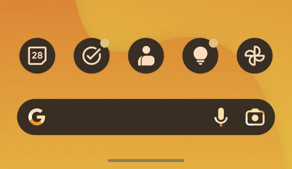
While we don’t yet have a visual for what this will look like, I can tell you one thing – they are going to be slick as hell. Imagine the themed icons you see in the image above which I took from my Pixel 6 Pro running Android 13. Now, imagine them along the bottom of your Chromebook’s shelf with plenty of space on the left and right of them.
The entire package will be complete once this update drops, and ChromeOS will truly look “suit and tie” with its visuals. I’m so incredibly excited, but I do have one concern. It’s likely that themed icons will only apply to system icons. I would be in heaven if Google found a way to apply this same look based on the dynamic colors of your wallpaper and system settings to PWAs or “web apps”. Interestingly, an update to Android will soon allow for any app installed from the Google Play Store to have a themed icon even if it was not preinstalled.
Now, if this technology can be applied to web apps, there would be absolutely nothing left over to make my Chromebook look ugly. For example, the icon for SunTrust Bank looked like a blurry porcupine (rest in peace, apparently). I used to “install” it or create a shortcut for my Chromebook customers back when I worked in stores selling and supporting ChromeOS, and it was just the worst offender of uploading a crappy .ico image.
Even without blurry icons or web developers failing to upload anything at all that appears when you create a shortcut on your laptop, my concern revolves around web apps that have more than two colors in their scheme. Even with machine learning and AI via a themed icons trick, I don’t know that Google could parse this out and create an entirely unique icon for non-system apps. Here’s to hoping I’m wrong!


Leave a Reply
You must be logged in to post a comment.