
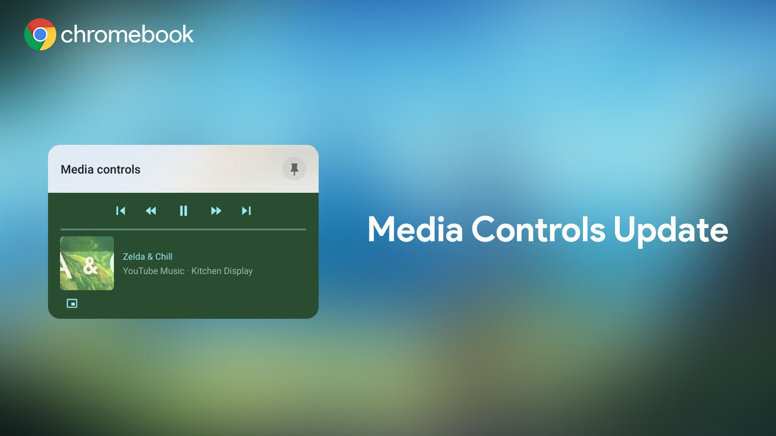
When global media controls were introduced to Chrome and Chrome OS, they were an incredible addition to the operating system. No longer would you need to swap between profiles, locate your music app or web app and unminimize it in order to pause it or jump between songs. Instead, Google carved out a special spot on the shelf or quick settings (depending on whether or not you have it pinned) for the media controls to permanently sit so long as something is actively playing. It even features a beautifully modern UI with thumbnail art, rounded corners and a themed color based on the cover of the album or song.
Unfortunately, I come bearing bad news today. Don’t worry, the media controls aren’t being killed off. Instead, Google decided to play a cruel joke on us all by flipping them on their head. In the latest version of Chrome OS Canary, opening the media button on your shelf will present you with your playback controls being positioned above your song or media information. Yes, it’s as topsy turvy as it sounds. Here, take a look:
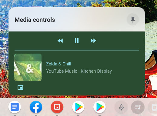
Truth be told, I have mixed feelings about this. On one hand, I completely understand why Google is experimenting with this. Psychologically, the most relevant information for this media center is being placed at the top – your controls. However, when you have multiple playbacks housed in this section – Youtube Music, a Youtube video, a family video from Google Photos, etc. – there’s just one thing that makes it a bit jarring – your brain continues to look below the media information for playback controls. The reason that’s an issue is that directly below the media info for a specific item are the controls for the very next item, not the one you’re trying to manipulate!
If the company is serious about implementing this, then perhaps it’s expecting its users to wrap their brains around this eventually. Otherwise, it’s probably just a test that won’t make it to the Stable channel. It’s important to note that each media item in the shelf rocks its own color, so this should, in theory, help your mind understand which buttons control which video or song, but after a few days of using this on my device, I can’t say that this is happening for me. Part of it could be that we’ve been looked at the album art and then looked under it for play/pause and skip backward and forward for decades. Another part of it could very well be that most sinistrodextral languages (based on Latin roots) are not only read from left (sinister) to right (dexter), but also from top to bottom, instead of the other way around as with dextrosinistral languages.
Google is no stranger to shaking up the tried and true computing formula long after it’s been accepted as the standard means to navigation and usage. Chromebooks are a very testament to this, but even on a smaller scale, it’s changed several things we’ve been accustomed to for decades. For example, in the Chrome browser, you no longer tap the escape button or go to the bottom-right side to take a video out of fullscreen. Instead, the Chrome team has determined that you hover over the top-middle of the screen, wait for an “x” to appear, and click it. While this felt weird at first, we all adapted pretty quickly. Now, it seems odd to do it the old way – at least for me.
This just goes to show that the “norm” doesn’t have to be the norm just because it has been. However, although I’d love to see what else Google can reinvent the standard for, I have to admit that so far, I’m not really feeling these upside-down media playback controls. To summarize, I love the idea, and I love the psychology behind it – I’m just not adapting yet. Let’s continue this discussion in the comments. Tell me what you think about this new playback UI, and whether or not you think it’s here to stay.
Newsletter Signup

Leave a Reply
You must be logged in to post a comment.