

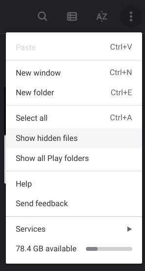
A little known, but extremely useful feature built directly into the Chromebook Files is the ability to access a visual storage quota bar that shows you how much space you are using versus how much space remains available. Upon opening Files and navigating to the Downloads folder or any other local storage location, you can tap the three dots “more” menu at the top right of the window and see the grey progress-style bar at the bottom of the context menu. See the image below for a visual understanding of what I’m referring to. My Pixelbook Go currently has 78.4 GB available internally.
Believe it or not, this also appeared for users who would click on the Google Drive portion of the Files app – Instead of showing local storage, it would show you how much cloud storage you were utilizing in Drive, and I absolutely loved it. I no longer had to navigate to Drive on the web in order to see how much free space I had for files. Sadly, this nice little touch has been removed in Chrome OS Canary this past week after years of existing as a part of Google’s operating system. To clarify, your local storage quota still shows visually as a bar in the Files app, but your cloud storage does not.
Upon thinking this through, I realized that though upsets me and likely many others, it was a move that made perfect sense. After Google took away everyone’s unlimited, free storage, its Google One service became more important, or at least finally relevant by force. Your cloud storage no longer just consists of your Google Drive and Gmail data. Now, it also includes your Google Photos and device backups. Not only that but if you’re a part of a family group, that storage no longer belongs only to you – it’s shared between you and five other potential family members.
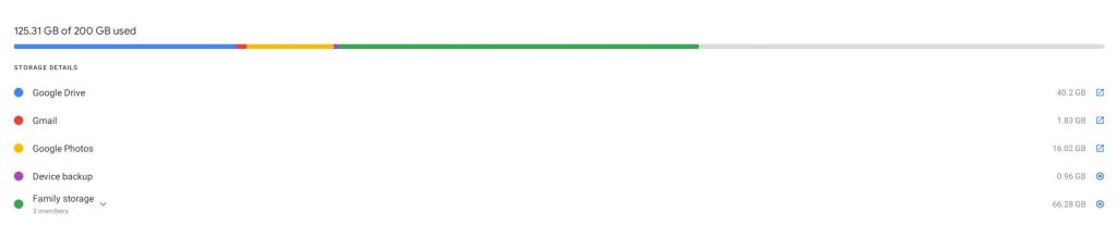
Keeping the storage quota indicator in the Chromebook Files app would actually prove to be counter-productive to users – it’s no longer accurate to show one simple bar using a two-tone grey color. While accessing Drive via the Files app is only showing you your Drive files, and yes, the previously built-in storage indicator could probably have continued to just portray that portion of your cloud storage, it would only be consistent for how much space you’re using. If it wanted to show you how much space remained available, it would be terribly inaccurate for the aforementioned reasons.
The removal of this feature – even if Google is just testing it – makes it clear to me that the company wants users to access their storage overview using the One app instead. I think I’m okay with this, but I would absolutely love to see this colorful Google One storage bar find its way into the Files app once Google Photos makes its home there as well. This way, users wouldn’t have to open a separate application in order to see the breakdown of their available space across services.
As the tech giant continues to polish the experience on its operating system, it’s also begun to think more seriously about how mobile data plans for LTE Chromebooks and Phone Hub users will affect the way that these devices are used. Just recently, it added an option into the Files app that prevents file syncing to the cloud over a mobile data connection – something I think will be very useful once we all start traveling again.
Newsletter Signup

Leave a Reply
You must be logged in to post a comment.