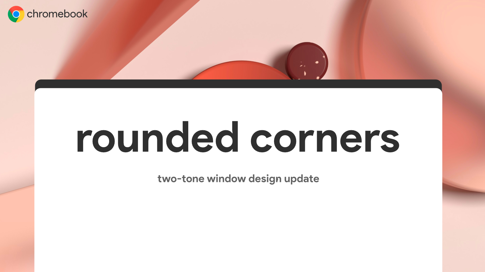
Just a month ago, I discovered that a few of the system windows in Chrome OS Canary had switched to a two-tone design with rounded corners in place of their previously sharp edges. It was a surprising yet exciting find, and I had a feeling we’d see more areas of the OS adopt this same approach before long. Well, I just received a Canary update and I brought up my file picker to find that it too had been rounded off!
You can see in my screenshots below how great it looks in both dark and light mode. Light mode looks super clean and straightforward, while dark mode has that same two-tone dark grey style I showed off with the Crostini and Phone Hub setups from before. Two things are immediately obvious to me now – first, Google is still slacking off with its dark mode implementation. It’s still an ugly mix of white and grey and quite honestly is difficult on the eyes.
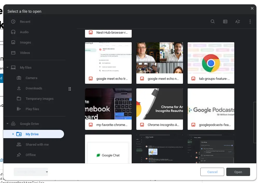

Second, the aforementioned Crostini and Phone Hub UI designs with rounded corners made use of the two-tone white body with a dark grey title bar in light mode, but now, the file picker in light mode is straight-up white on white, which leads me to believe that Google has changed its mind on how it’s going to roll this out. Dark mode looks to be the only theme that will use two colors – a dark grey body with a slightly lighter grey title bar, while light mode will now remain minimalistic. If you ask me, I think this was a smarter choice on behalf of the development team.
Oddly enough, the standard Files app (when opened from the shelf and launcher as opposed to being launched to locate files) has retained its odd and outdated sharp corner design. This is a fresh out of the skillet update that’s was cooked up for Canary just moments ago, so the obvious path forward is to extend this beautiful, new design through and through in time – not just to the Files app, but to all of the windows across the entire operating system.
With Windows 11 adopting rounded corners before Chrome OS via its Insider Preview, I hope that Google finalizes everything in time to roll out a completely new UI for Chromebooks before long. Perhaps the company is getting ready to push Material You on its laptops after all – the new UI here looks a lot like my mock-ups from a while back!
Newsletter Signup


Leave a Reply
You must be logged in to post a comment.