The new Side Panel experiment that Google has rolled out to the Chrome browser is fast evolving into a useful tool. Not only does it house your bookmarks and Reading list items, but Google Lens integration recently joined in the mix when using it on desktop.
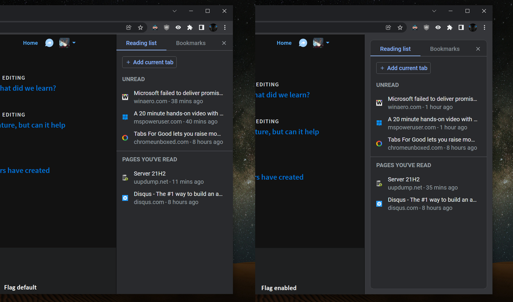
One thing I’ve always felt though is that it’s all been implemented so plainly. Of course, it’s still in its early stages, but a new Chrome developer flag will give the side panel some style. The “Side panel border” will separate your contents out from the background and pad them a bit more, making them pop.

Side panel border
Enables a border around the side panel. – Mac, Windows, Linux, Chrome OS
#side-panel-border
First discovered by our favorite Redditor Leopeva64-2, the new flag will only appear on Chrome Canary at this time, but will surely expand outward and toward Stable before long. The developers have also done some work around connecting the Side Panel to the bookmarks bar above it so that it looks more natural. The color and divider separation between the panel and the rest of the browser wrapper has been dissolved to provide a more consistent experience.
Whether or not you use the Side Panel, you have to admit that this simple border makes everything more legible and easier to visually scan. My biggest gripe now is that you can’t resize the sidebar, and hovering over a saved Reading list item doesn’t provide a tooltip to show the rest of the title for an item. The problem with this is that as it stands, the contents in the panel are not always easy to read or gain context around.
Newsletter Signup


Leave a Reply
You must be logged in to post a comment.