
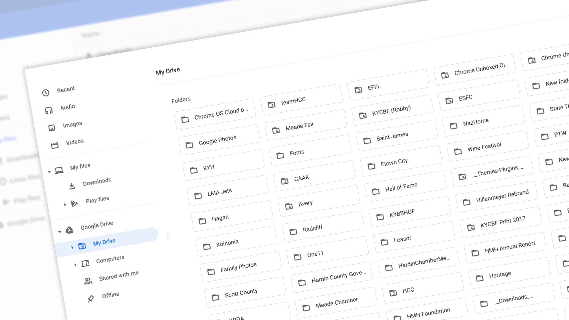
The files app on Chrome OS has been largely unchanged for quite some time. The look has been consistent and the functionality has largely been left unchanged over the years. That’s not to say there haven’t been productivity enhancements like the addition of read-only volumes (think recent, audio, images, and videos), Linux file management, custom folder systems, and Android app file management. On the outside, though, the older Material Design has looked dated for quite some time, and in a surprise move, Chrome OS 84 finally brought along the long-awaited visual overhaul to the Files app that we first saw back in March of this year.
Honestly, it feels like we’ve been tracking this change for a very long time, but perhaps that is because it has been available and working in the Developer and Beta Channels of Chrome OS for some time now. We jump around through the channels often and this new Files app layout has been presenting itself in the non-stable versions of Chrome OS for over four months at this point.
Nowhere in the release notes or announcements did Google point this out, but as all our Chromebooks updated to 84 this morning, we began seeing the freshly-skinned Files app right out of the box without additional settings or flags. In some ways this feels like the theme of the 84 update: tons of features that have been hiding behind flags simply becoming part of the experience now.
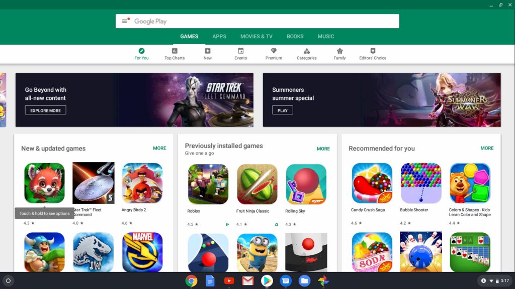
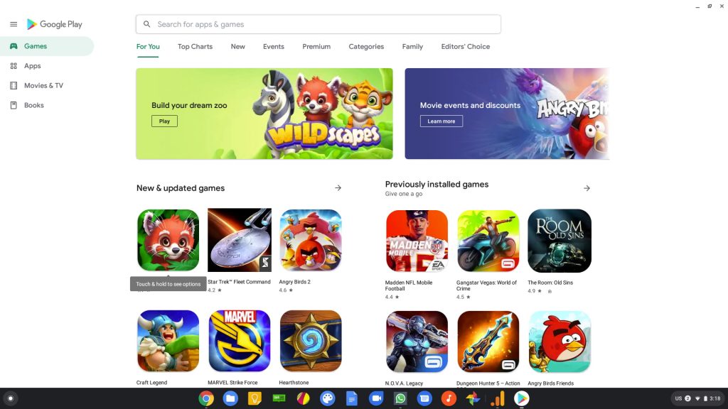
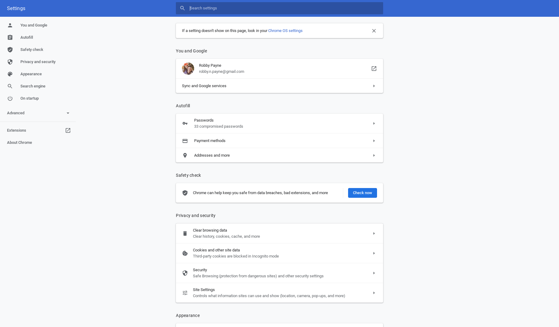
Functionally, nothing is changing with the app. It simply gets a makeover similar to what we saw a few months back with the Google Play Store and the Chrome OS Settings app. Gone are the large blocks of flat colors and, in their place, the UI is mostly white, clean and simplified across the board. Take a look at the screenshots below for a before and after of the Play Store, Chrome settings and the Files app to see Google’s cohesive design language at play.
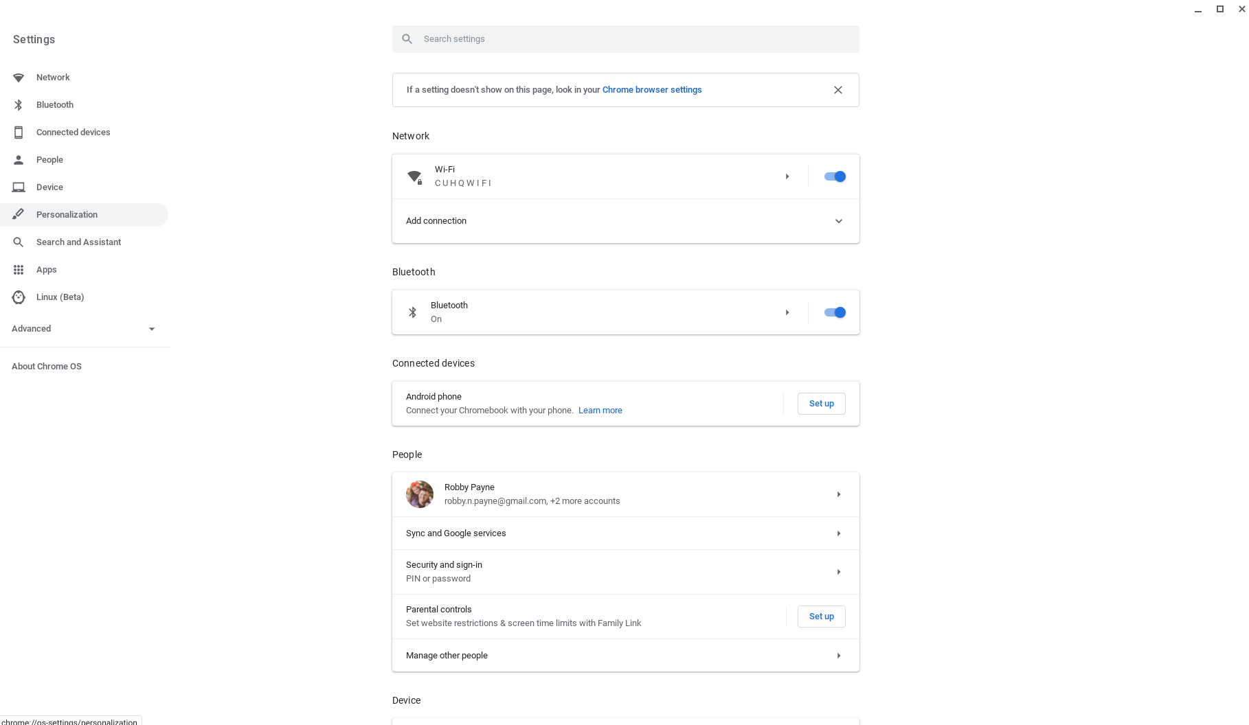
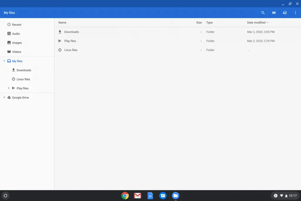
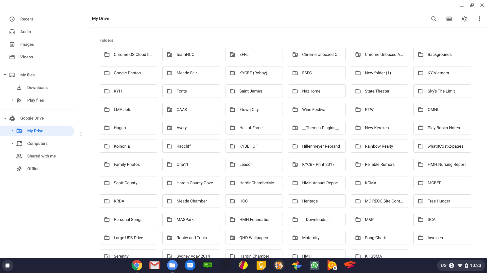
Again, little is changed from a functional standpoint, but this overhaul feels so much more at home in Google’s current design philosophy. One part of the experience in using the app that is a tad different is the way you resize different portions of the screen. In the old app, you simply grabbed the divider lines and moved things around. With the new look and lack of clear dividers, users now grab the 6-dot grids that separate the columns of the Files app. While I like the removal of grid lines around the app’s interface, I don’t love this change from a usability point of view. It does look clean, though.
And that’s really the point of all this. Cleaning up the UI for a core application isn’t so much about making it easier to use as much as it is about aligning all the interior parts of the OS to feel and function in the same ways. Similar layouts and common UI elements go a long way towards making users feel at home and comfortable, and as more new users come into the Chromebook fold, these types of updates help the transition in big ways over time. Keep an eye out for more on the Chrome OS 84 update as we continue highlighting the big changes that showed up in today’s update.
Shop Best Chromebooks of 2020 So Far on Chrome Shop
Newsletter Signup

Leave a Reply
You must be logged in to post a comment.