 If you spend any time on our site or you are Chrome OS tinkerers like we are, you are likely familiar with
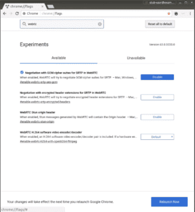
 chrome://flags. Flags are simply switches for features that are still under development, experiments or settings that may be getting deprecated in steps.
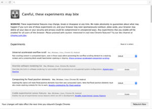
These “flags” are accessible, not only on Chrome OS but any Chrome browser whether it be Chromebook, mobile or desktop. While these flags can be a cool way to test out new features, they can also be quite finicky so be cautious before you go clicking the enable buttons. They can bite.
Last week, Chrome Story reported on an addition to the repository that reveals an upcoming remodel of the chrome://flags page that will give it a much more modern look that falls in line with Google’s Material Design initiative it has been pushing into its products.
The initial report showed a screenshot from last year that gave us an idea of what the new page may look like. However, today developers added some new images and a video of the revamped flags page in actions.
Below you can see the image from last year on the left and the current, soon-to-be-launched flags page for desktop and mobile on the right.
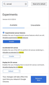
The details get even better as the developer has added a video preview of the flags page in action. Below you can see the newly designed page has a much cleaner look and has added an inline search feature to make it easier to locate a specific flag.
The flags page may be of little use to the average Chromebook user but the update is much needed and it continues Google’s ongoing effort to create a seamless, unified ecosystem for all of its products.
We’ll keep an eye out for this update to hit the Developer channel and report back as soon as it goes live.
Source: Chrome Story, CRBug
Leave a Reply
You must be logged in to post a comment.